UX/UI Project
Solar Buyer’s Guide
The project: Building the reference site on energy management products beginning with apples-to-apples comparisons of solar panel system components.
Browse and compare
solar components
EnergySage is an online solar marketplace connecting homeowners and businesses with a pre-screened network of solar installers. Customers receive up to seven solar quotes that they can compare apples-to-apples.
We needed to build a tool for customers and installers to compare solar equipment (panels, inverters, and batteries) that would be extensible to additional energy products and categories in the future.
Background and Objectives
My Role
UX/UI Designer & Project Lead
Survey key stakeholders for business and user experience goals, create alignment on requirements for version 1 (v1)
Build the project charter / MRD and present to leadership for feedback and approval
Conduct user research
Interview consumers, installers, and manufacturers
Understand what users want to compare and what’s important to them
Conduct design research
Explore similar, successful platforms (functionality, UX/UI, communication)
Define system patterns & frameworks
Draft wireframes
Produce high fidelity designs that cover each part of the experience
Business Benefits & Key Features
Benefits to Our Audience
Help consumers learn, compare and choose technologies, products, and manufacturer brands that are right for them and feel more confident in conversations with installers
Help installers decide what to stock and how to quote on EnergySage
Help manufacturers to drive consumer preference and installer loyalty on EnergySage
Benefits to EnergySage
Enhance our trust and stature in the clean energy industry
Support SEO strategy
Increased satisfaction and loyalty in the marketplace
Engage manufacturers leading to investment in consumer demand generation on our platform
User Experience
SEO tuned category pages for organic discovery
Showcase manufacturer promotions
Simple comparison tools
Detailed manufacturer and product profile pages
Integration
Serve as a conversion funnel into the Marketplace
Pages are source of 'more details' in the ES Marketplace, linked to quoting tools for installers
Foundation for seamless solar project quoting
Design
Wireframes
Based on the required components and design research, I began mobile-first digital sketches of the various pages of the experience.
Product type search page
Product cards
Featured
Filters
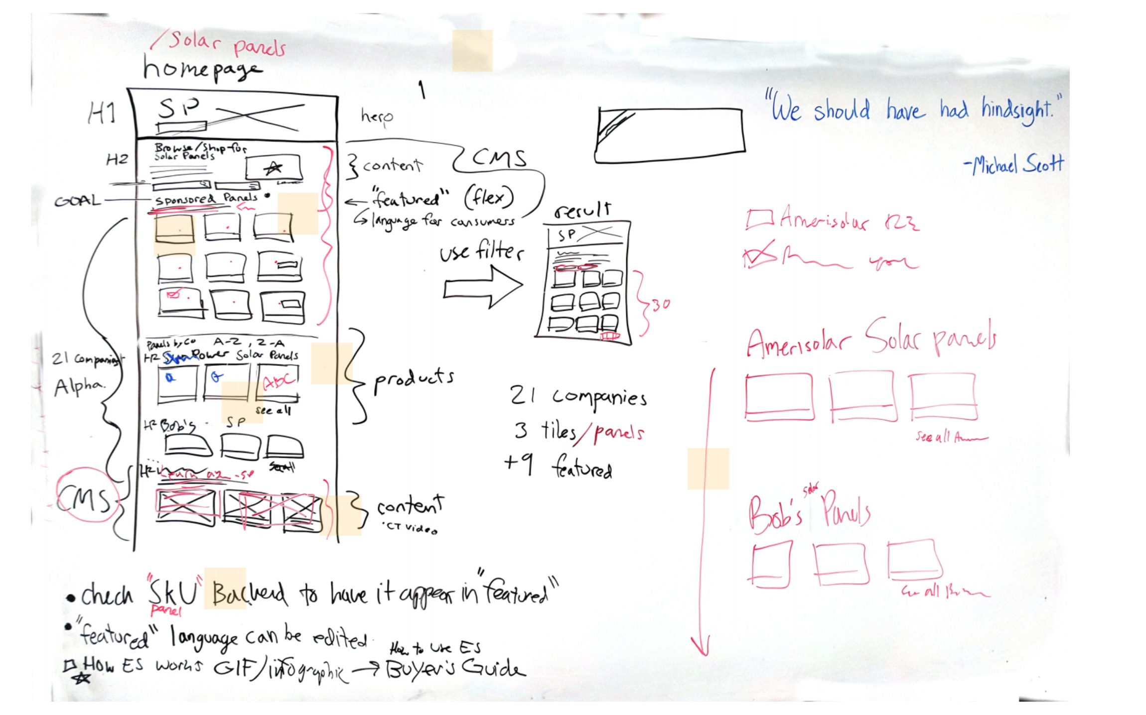
Solving marketing strategy challenges
The marketing team had content and hierarchy requirements to boost SEO for these pages. I worked with the marketing and engineering teams to ensure we didn’t run into scope-creep for this first version of the Buyer’s Guide but got the benefits of our solid SEO strategy.
We sketched the changes on a white board, discussed tradeoffs, and emerged with a plan.
White board ideating on edits to the wireframes to ensure SEO solutions are included
Explorations of high-fidelity product cards
The amount of information stakeholders requested I include on this “snapshot” of the product would be too much.
Panel name and wattage
Image and manufacturer logo
EnergySage rating and reviews
Promotion if applicable
Model, warranty, country of manufacture
Comparison UI
Filters were chosen based on our access to data about the panels and preferences learned from user research. The team and I eliminated the amount of content on the product cards to provide a cleaner snapshot.
Users needed to be able to:
View component details on separate page
Compare multiple options side-by-side
Outcomes
SEO & Site Traffic changes
Google search ranking position for search phrase “solar panels” moved EnergySage from 13th place to 4th place
Steady, ongoing increase in entrances and new users
Significant increase in entrances and users per week
Increase in leads per month/conversions to Marketplace

