UX/UI Exercise
Scaling to Enterprise
Store locations dashboard design
UX/UI Design Exercise
This Case Study provides a walkthrough of my approach for scaling the design and functionality of a Point-of-Sale (POS) company. The company, Cube, and the design brief are fictional.
Fictional Brief: Transforming a small-scale application into an enterprise-level product
The Point-of-Sale company, Cube, just signed a contract with a large regional convenience store chain. Our application, previously used at Mom-and-Pop shops, now needs to support hundreds of locations with thousands of products.
My role: UX/UI Designer
Tasks
Outlining the organization of various Point of Sale elements
Part I
Design Wireframes of the screen (or set of screens) which will allow the Pricing Analysts who use the Cube software to build store groups for organizing their store locations.
Part II
Explore ways to provide the Pricing Analyst with better visibility to implemented price values to quickly uncover price anomalies or pricing that does not comply with the active price list for a product within the store group.
I was limited to 5-6 hours total to complete the exercise
Plan Overview
Outline business and experience goals
Identify user needs to inform features
• Interviews or persona development
• Jobs to be done
• Out of scope: Customer interviewsConduct competitive research
Create wireframes of solutions, draft a prototype, check against UX heuristics
Out of scope: Test with users after selecting one or two options with Product Manager
Process
Business Case & Experience Goals
Scaling for Growth
Iterative approaches to moving toward enterprise-level service and tools
Product must adapt to expectations of new user base
Sustainable Maintenance
Reducing manual processes to support exponential growth of our customers’ locations and products
Drive customer satisfaction through reduced time to task success
Competitive Service
Providing features and services that are more delightful and usable than those of our competitors so more customers will choose our software for their POS needs
Business impact (potential KPIs)
Raise user retention when viewing their POS dashboard
Together with the ability to set price lists, and product lines, the store groups functionality provides fast and simultaneous control for businesses.
Understanding our users: Penny the Pricing Analyst
What does a Pricing Analyst do?
Pricing analysts research the history of products and market trends. They set product prices based on data and communicate changes and trends to company stakeholders. They are responsible for tracking sales of products or services over time and making pricing changes to maximize profit.
I drafted a journey map for Penny, the Pricing Analyst persona. I approached the map as “the journey so far” to empathize with potential struggles Penny has encountered and understand what Cube will need to offer to drive the success of her work and her company, Fly Away Convenience.
Competitive Research
See how competitors are currently enabling users to set store groups
Are they consistent?
What elements for the UI might be most useful and familiar for users?
Learned UI vs. innovation
Should we innovate or follow existing patterns?
How can we keep it straightforward for our users but offer something that stands out or makes their jobs even easier?
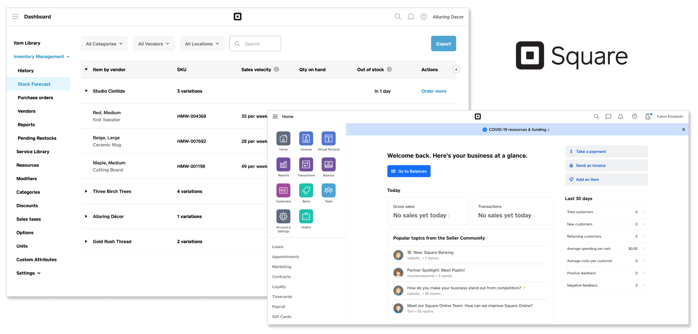
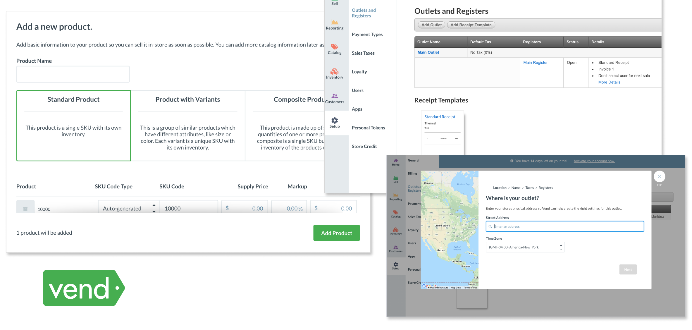
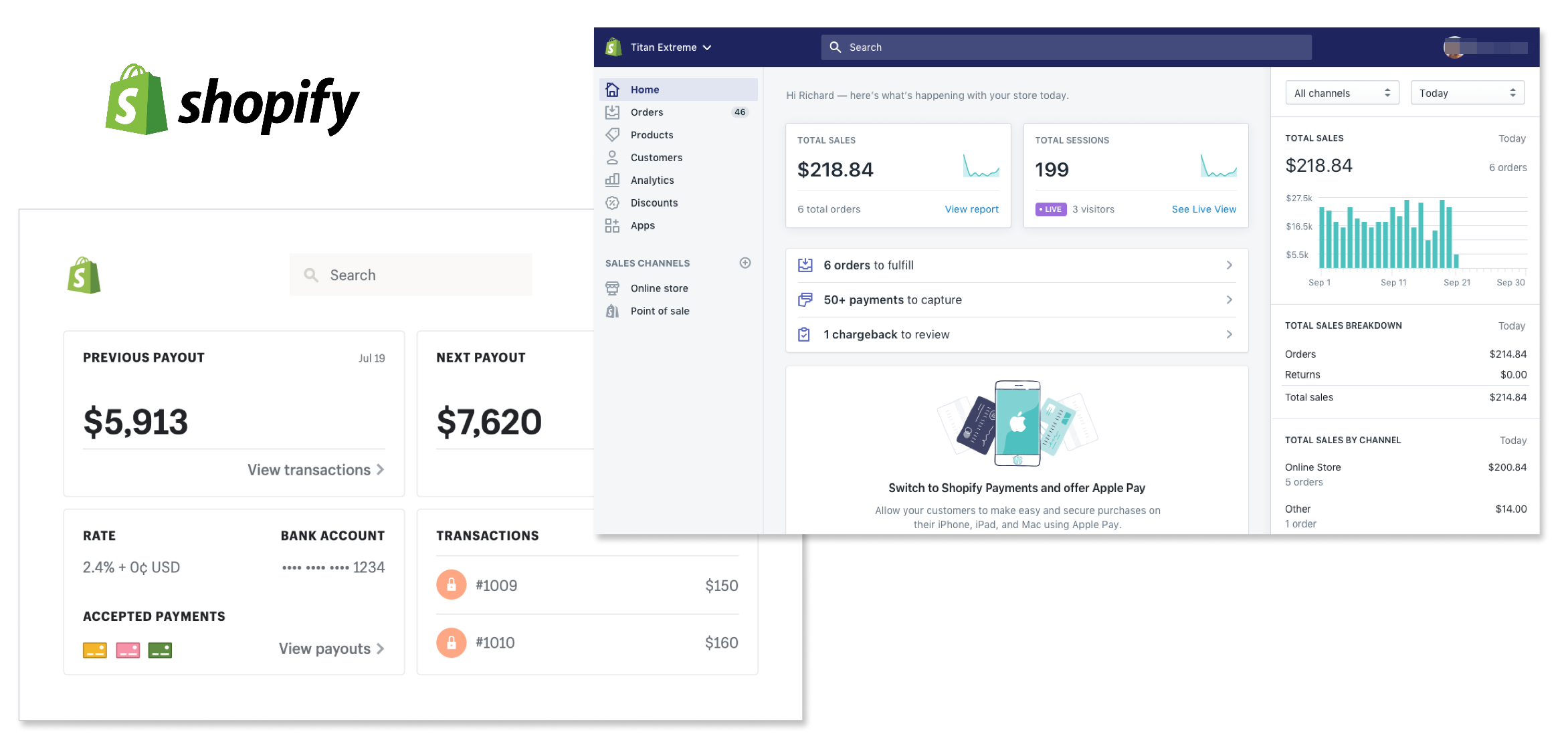
I looked at Square, Vend, and Shopify. Each application used top and left-rail navigation. The modular designs create a clean aesthetic and easy comprehension.
Building the Experience
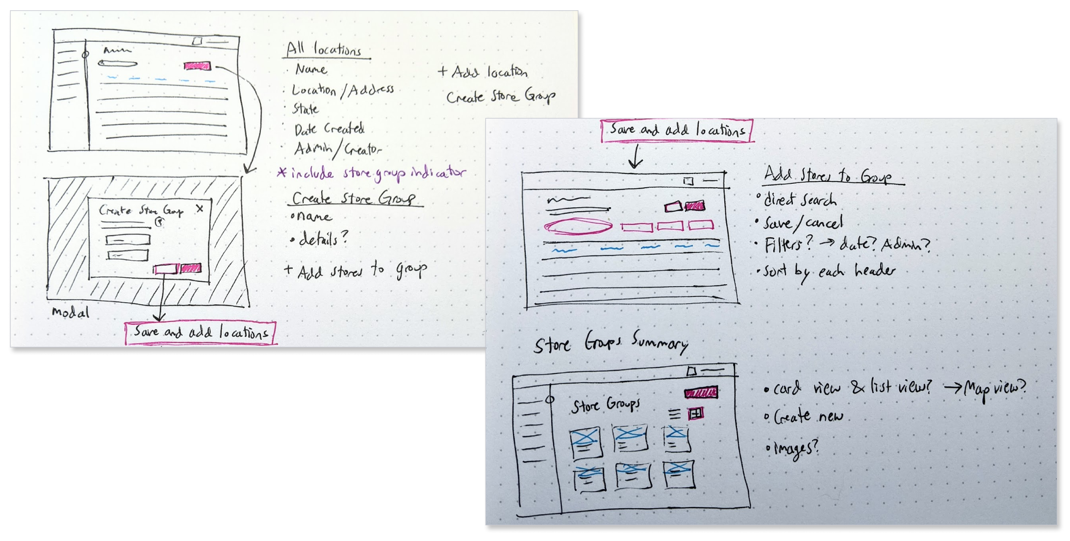
Sketching Solutions
The Cube product would have some existing branding and a baseline interface from which the company would work from to scale up.
I used paper sketches to…
Build baseline structure
List features for setting store groups
Outline the steps needed for the task
Sketching solutions on dot grid paper
Wireframes
I drafted digital wireframes of the proposed experience for setting store groups and opted to flesh out the branding bit more (next section) to give a better sense of the interactions and features.
Wireframing the experience for setting Store Groups
Setting Store Groups
1. Navigate to the Locations tab
Users navigate to the Locations tab in the left rail navigation menu and click “Create Store Group” on the right.
The Locations tab displays all store locations for the convenience store chain, Fly Away Convenience. I made assumptions about which categories of data would be the most useful for Pricing Analysts. Each category is sortable.
2. Create store group
A simple modal appears to allow users to set the store group name, an optional description of the group, and the ability to copy an existing price list in order to speed up the process for setting the group’s pricing.
Users can then continue to ‘Save and Assign Locations’ to the store group or simply ‘Save’ and work on it at another time.
For this example, the user selected “Save and Assign Locations.”
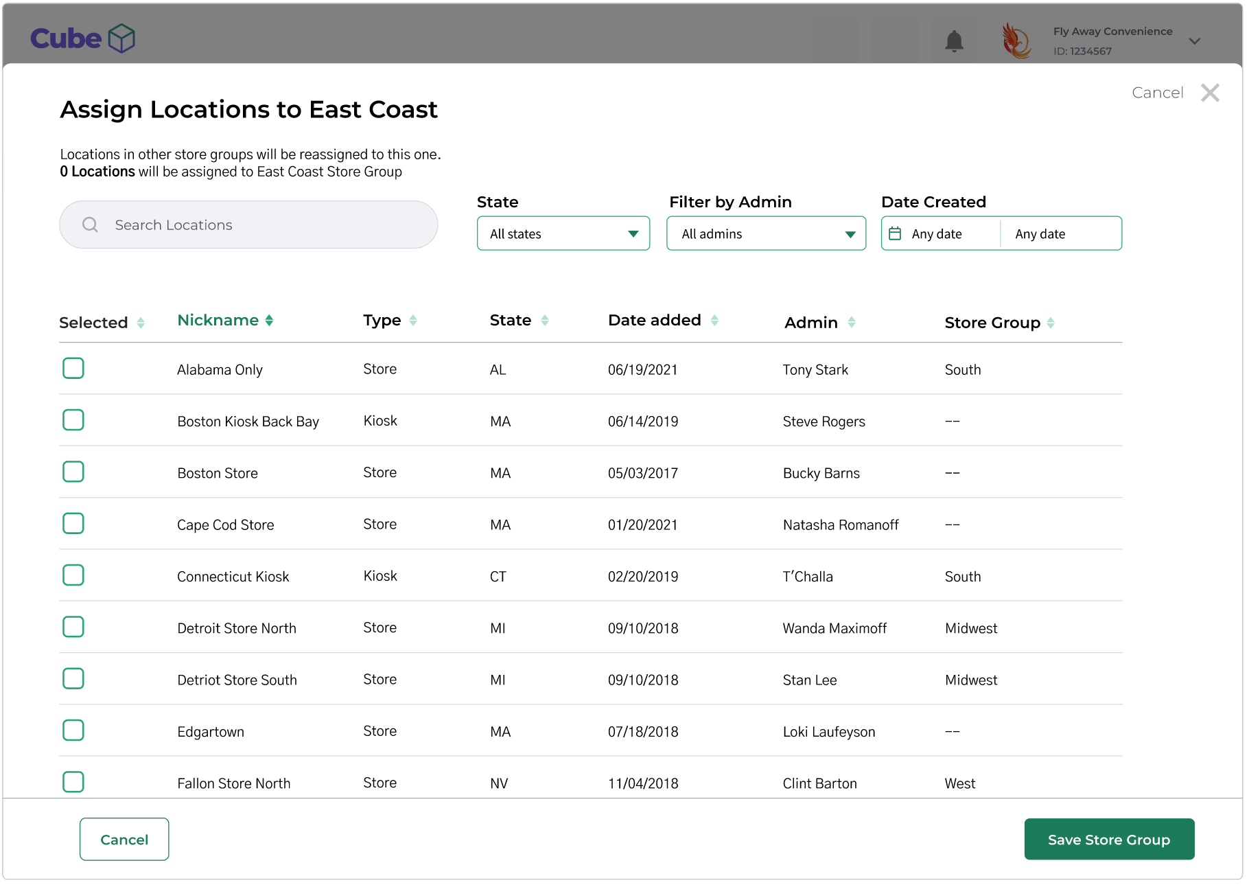
3. Assigning stores
Users can directly search for stores to include in the new store group or filter by state, admin, or date range. Data is sortable where it makes sense.
4. Select stores
As stores are selected, the row becomes highlighted. Green indicates a successful selection. Yellow indicates a warning. In this example, the yellow highlighted store is already assigned to another store group.
A warning appears to confirm moving a location from one store group to the new store group.
A simple summary screen enables users to see the store groups they have created and make changes.
Addressing Price List Anomalies
Assumptions
As Store Group member composition is shifted around, non-conforming prices may emerge.
As new products are introduced, there may be no price at all for the product.
Research
How do non-conforming prices occur?
Gain deeper understanding of how price lists differ
Hypotheses
Warnings
Product Analysts will want a warning or some indication that there is a price anomaly as Store Group members are changed.
Admin Controls
By setting rules and enabling controls for who can add products and change Store Groups, the occurrence of non-conforming prices will be reduced.
Potential Tools
Notification system when new products are added or prices are changed
Filter to show stores with price anomalies
Override indicators (sale, discount, promotion etc.)
Indicating discrepancies
Discrepancy indicators on individual stores allow users to note planned or temporary changes and errors.
Warnings on store groups give high-level insight that one or more stores have a pricing conflict.
Notifications signal changes made by other admins that require attention or action.
Next Steps: Test and Learn
Test hypotheses through user research using prototypes
Recruit the users we’re solving for to ensure we’re making the right solutions for their needs
Recruit a few users from existing user base to reduce the amount of processing time so users can focus on providing feedback on the new features
What do we want to know?
Are we offering the right filters and displaying the most useful metadata?
What information are users looking for? Can they find it?
What questions to do they have? What steps would they take to answer those questions?
How would users describe the purpose of the Store Groups feature?
Would they recommend Cube? Why or why not?
Analysis: Based on the feedback received, will the component will achieve business goals?
Raise our retention users have when viewing their dashboard
Provide an in-depth look at a company's financial performance.
Analysis: What changes, if any, should we make based on the feedback?
Do the changes warrant additional research and testing?
What, if any, additional insights were captured?
Future feature ideas
Experience enhancements
Confusion, friction, frustrations


